


client:
mountain equipment company
project:
ultralight collection
overview:
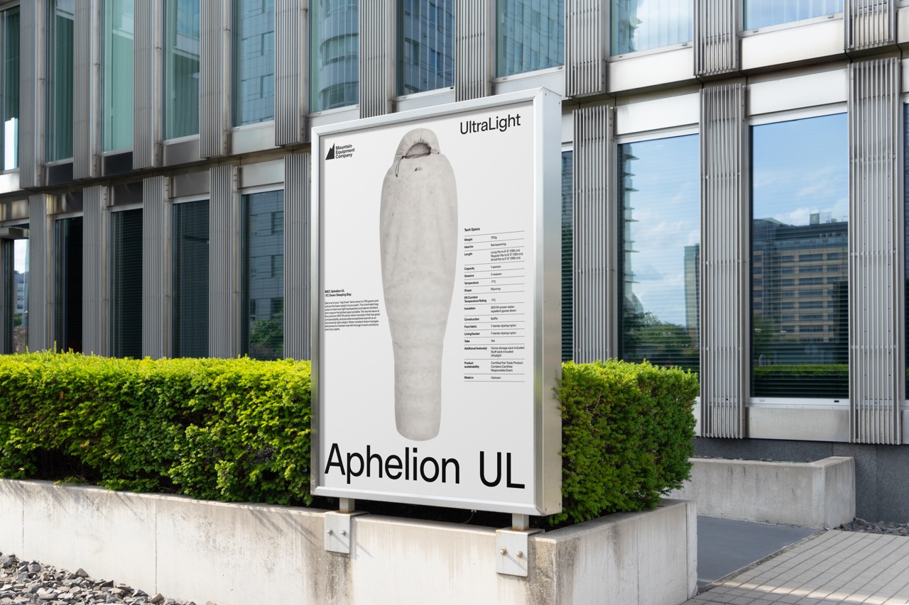
a proof of concept for the launch of MEC’s Ultralight collection, this system was built around a single principle: reduction as performance. it is the thesis. The design needed to reflect that same discipline. Nothing added that the product itself would not tolerate. The layout draws from Swiss modernist grid systems and the industrial clarity of Herman Miller’s archival product catalogues. Strict margins. Mathematical spacing. Asymmetrical balance resolved through proportion rather than decoration. White space functions as negative weight, allowing the composition to breathe the way ultralight gear allows movement. Products are isolated and centered like engineered specimens. No terrain. No lifestyle framing. Just object and specification. Technical data is treated as primary content, not footnote. Weight, R-value, denier count, packed dimensions, and fabric construction form a structured columnar system that mirrors engineering documentation. The specs are the story. Typography operates with mechanical confidence. “Ultralight” reads as a categorical declaration. Product names scale across the baseline, anchoring each page like structural beams within the grid. Hierarchy is resolved through size and alignment, not stylistic flourish. The result is a launch system that removes visual excess the same way the collection removes physical mass. A study in subtraction.
graphic designer:
cody w gannon