client:
runuphill / skiuphill
project:
canmore quad
overview:
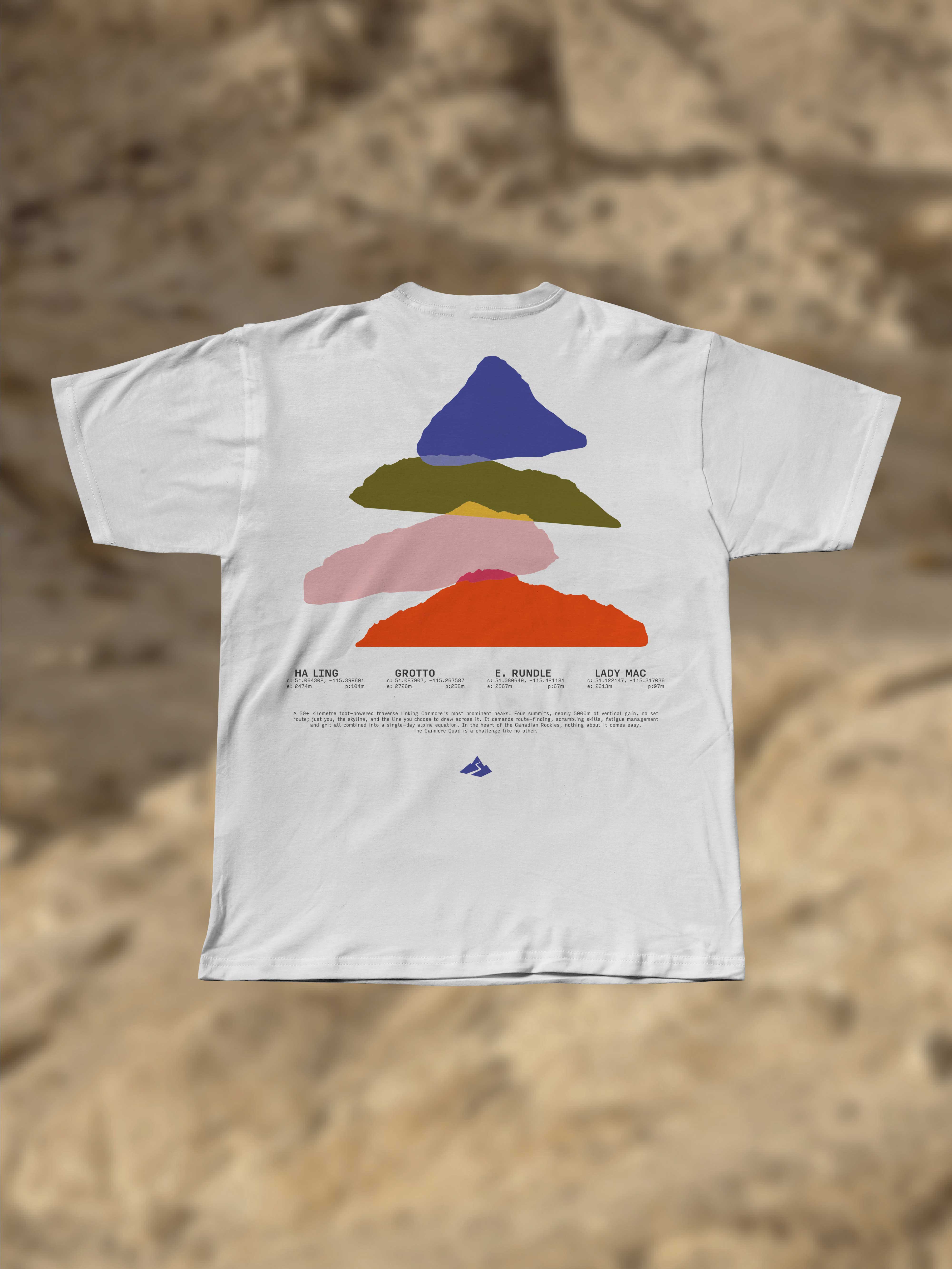
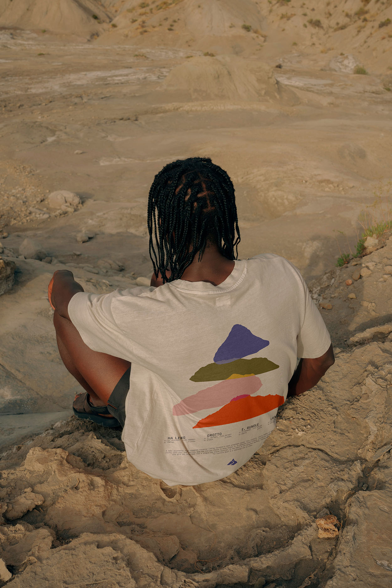
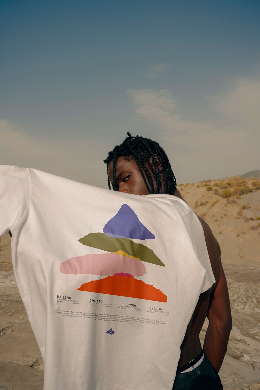
Commissioned by RunUphill / SkiUphill, this shirt was created as the official visual for the Canmore Quad—a freeform, four-peak endurance challenge that has become a cult fixture in the Bow Valley trail community. The creative ask wasn’t for just another event tee; it was to design something that felt like the race: brutal, beautiful, and entirely self-governed. Something that reflected the unique character of RunUphill as a brand—raw, technical, community-driven—and translated the complexity of the day into a single, wearable form. A visual reduction of vertical punishment: four peaks, four vectorized silhouettes, vertically stacked to mirror the mental load of the route itself. Each mountain—Ha Ling, Grotto, EEOR, and Lady Mac—was redrawn from topographic data, then flattened into a single-plane elevation profile. The composition leverages symmetry not for aesthetic comfort, but to simulate psychological contrast: the illusion of balance in an otherwise disorienting day. Colour was treated functionally—separate chromatic weights assigned to each peak to represent distinct phases of exertion. A psychological gradient shifting from composure to friction, through disorientation, and finally into conviction. Each tone calibrated to capture the internal transitions that unfold over 50+ kilometers of voluntary suffering. Typography is set in a monospaced system font for pure utility. Coordinates, elevation gain, and prominence operate as a stripped-down legend—a nod to analog mapping and analog endurance. Form follows fatigue.
producer:
graphic designer:
craig mathieson
cody w gannon